
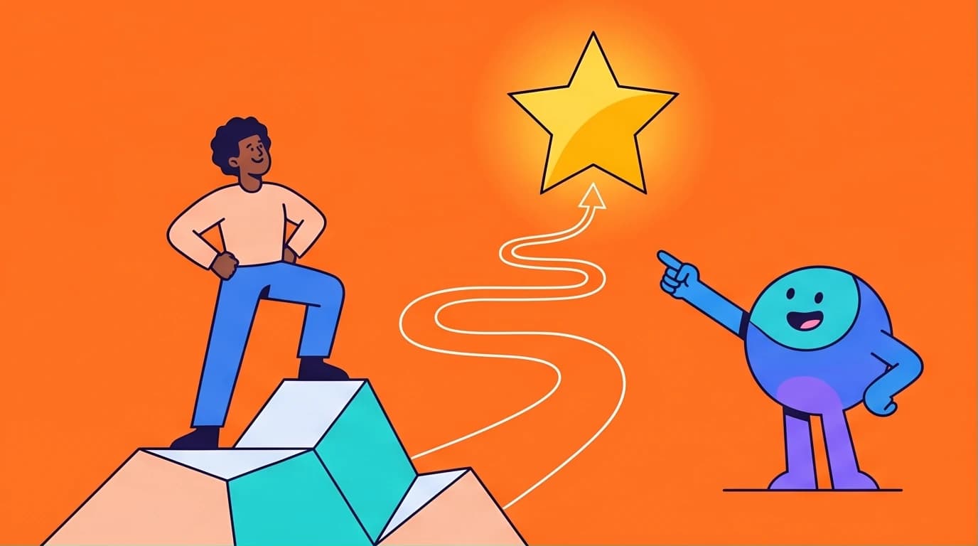
Visitors leave your site in seconds if they cannot figure out exactly what you do and how it helps them survive or thrive. You understand that the customer should be the hero of the story, but translating that theory into a functional, revenue-generating digital asset is where most businesses stall.
This shift in perspective from the business as the hero to the customer as the hero is the single most important concept in the entire StoryBrand framework. Understanding this paradigm shift is crucial before structuring your website.
The Anatomy of Clear Messaging Website Design
Traditional websites operate like digital brochures. They boast about company history, list complex features using industry jargon, and feature photos of the corporate office. They play the hero.
A StoryBrand website operates as a clear, systematic sales funnel. It leverages clear messaging website design to answer three questions immediately:
- What do you offer?
- How will it make my life better?
- What do I need to do to buy it?
If a first-time visitor cannot answer these questions within five seconds (often called the Grunt Test), they will bounce. To fix this, you must stop organizing your website around your company and start organizing it around your customer's journey.
Here is exactly how to storybrand your homepage, broken down section by logical section.
If you want to master the foundational principles behind this customer-centric approach, diving directly into the source material is your best next step. Donald Miller's groundbreaking work provides the exact blueprint for clarifying your message so your ideal clients actually listen. It is an essential read for any business owner ready to stop wasting money on digital brochures and start building an effective, revenue-generating sales engine.

Building a StoryBrand
Donald Miller
To fully grasp how these website sections work together, it's essential to understand the underlying narrative structure Donald Miller proposes. This core framework is the engine that powers every high-converting StoryBrand website.
While reading the full book is invaluable, it can be a challenge to find the time. If you're looking to absorb the key ideas from this and other business bestsellers quickly, an app can help.
Get the core principles from essential marketing books like 'Building a StoryBrand' in 15-minute audio or text summaries, perfect for busy entrepreneurs.

Download LeapAhead App now
Section-by-Section Structural Breakdown
Looking at storybrand website examples without understanding the framework underneath is like looking at a finished house without seeing the blueprints. Every high-converting StoryBrand page follows a predictable, highly analytical structure.
1. The Header: The Grunt Test Section
The top section of your website (above the fold) is your most valuable real estate. Do not waste it on clever puns or vague mission statements.
- The Heading: State exactly what you do. If you sell commercial roofing, your headline should not be "Reaching New Heights." It should be "Durable Commercial Roofing for Demanding Climates."
- The Subheading: Briefly explain how this resolves a pain point or brings value.
- The Imagery: Show a happy customer experiencing the successful result of your product. Do not show empty buildings or confusing abstract art.
- The Direct Call to Action (CTA): Place a distinct, brightly colored button in the top right corner and the center of the header. Use transactional language like "Buy Now," "Get a Quote," or "Schedule a Call."
2. The Value Proposition & The Stakes
Once you hook them, you must establish why they need you. What happens if they do not buy your product?
Identify the core problem your customer faces. Make them realize you understand their frustration. If you run a B2B logistics company, your customers are likely tired of lost shipments and unpredictable delays. State that clearly. Follow it up with a section detailing the successful resolution—what their life looks like after hiring you. Use short bullet points to highlight the top three benefits.
3. The Guide: Empathy and Authority
Your customer is Luke Skywalker. You are Yoda. The website must position you as the competent guide equipped to help them win the day.
You do this through two specific elements:
- Empathy: A brief statement showing you understand their struggle. ("We know how frustrating it is to deal with unreliable contractors.")
- Authority: Logos of brands you have worked with (e.g., Amazon, Apple Books, or local industry leaders), client testimonials, or relevant statistics. Keep this brief. You only need enough authority to build trust, not a massive ego wall.
4. The Plan: Three Simple Steps
Confusion is the enemy of conversion. If the buying process looks complicated, customers will abandon it. You must outline a simple path to engagement.
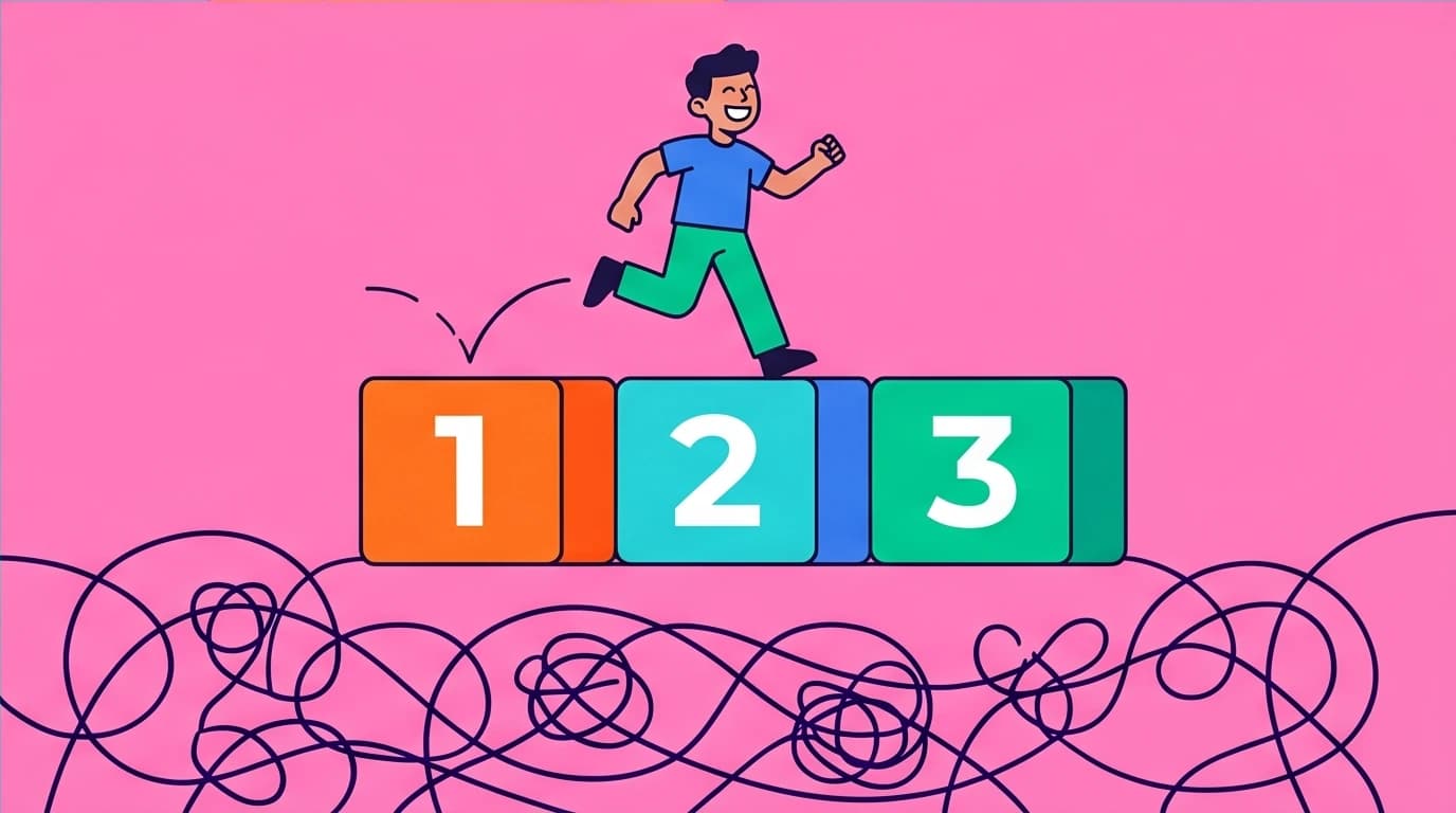
Break your process down into three simple steps.
- Schedule a Consultation. (The commitment)
- We Customize Your Strategy. (The work you do)
- Watch Your Sales Grow. (The successful result)
Even if your actual fulfillment process has 45 steps, your public-facing agreement plan must be distilled down to three easy, digestible milestones.
5. The Explanatory Paragraph
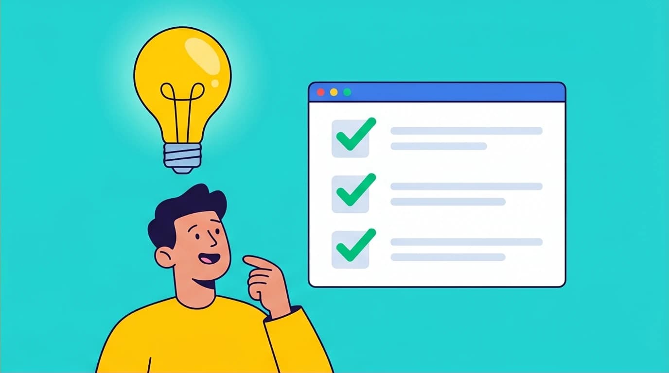
Search engines need text, and highly analytical buyers need details. This section satisfies both. Include a well-written, keyword-optimized paragraph that dives deeper into your methodology, overcoming objections, and reiterating your core message. This is where you can appease your SEO requirements without cluttering the top of the page.
6. The Lead Generator (Transitional CTA)
Not everyone is ready to marry you on the first date. For those not ready to click the direct CTA, offer a transitional CTA.
This is your lead generator. Offer a high-value piece of content—a PDF guide, a checklist, or a free email course—in exchange for their email address. If you are selling a $5,000 HVAC system, a user might not buy instantly, but they will download "5 Signs Your AC Unit is About to Fail." Once you have their email, you can nurture the lead through an automated drip campaign.
Once you capture those email addresses, you need to know exactly how to guide those prospects through a profitable journey. If you want to maximize the return on your newly optimized website, learning the science behind digital funnels will completely change the way you view web traffic. Understanding how to structure your backend offers ensures those fresh leads transform into loyal, paying customers over time.

DotCom Secrets
Russell Brunson, Dan Kennedy
7. The Junk Drawer (Footer)
Take every link that does not directly lead to a sale—your About Us page, careers, FAQ, terms of service, and social media icons—and push them to the very bottom of the page. This keeps the main navigation clean and forces visitors into your designated sales funnel.
Building Your StoryBrand Wireframe Template
Before you hire a designer or touch a tool like WordPress, Webflow, or Squarespace, you must build a storybrand wireframe template. Design should always follow copy, never the other way around.
A wireframe is a black-and-white, text-based blueprint of your website. Creating a wireframe forces you to focus strictly on messaging and structure rather than colors or typography.
The messaging for this wireframe is developed using a tool called the BrandScript. This document serves as the single source of truth for all your marketing copy, ensuring your message stays consistent and clear.
How to structure your template:
- Top Navigation: Logo on the left, primary Direct CTA button on the right. Nothing else.
- Hero Section: H1 Headline, sub-headline, Direct CTA button, placeholder for an image of a smiling customer.
- The Stakes: 3-4 bullet points highlighting the cost of inaction.
- Value Prop: 3 core benefits the customer receives.
- The Guide: A row of 4-5 authority logos (trusted by...), followed by one powerful customer testimonial.
- The Plan: Three numbered columns mapping out the buying steps.
- The Explanatory Paragraph: Text block with a clear header.
- Lead Generator: Headline offering free value, input field for an email address, and a download button.
- Footer: All secondary links.
Writing your copy directly into this template format guarantees you do not drift away from the core narrative. When you hand this wireframe to a developer, you guarantee the final product will function as a high-converting storybrand landing page rather than just a digital art project.
Filling out your wireframe is much easier when you know exactly what words will compel your target audience to take action. Because great design can never save weak messaging, mastering the art of persuasive writing is absolutely crucial before you launch. Discover proven formulas and actionable advice to draft powerful headlines, engaging value propositions, and irresistible calls to action that consistently drive high conversion rates.

Copywriting Secrets
Jim Edwards
Common Mistakes That Kill Conversions
Even when applying these principles, businesses frequently fall into a few predictable traps.
Using Passive Direct CTAs
"Learn More" or "Get Started" are passive and vague. The brain has to burn calories to figure out what "getting started" actually means. Use concrete verbs: "Buy Now," "Schedule a Call," or "Claim Your Free Trial." Ensure this button is a contrasting color from the rest of your site and repeated frequently as the user scrolls down.
"Learn More" or "Get Started" are passive and vague. The brain has to burn calories to figure out what "getting started" actually means. Use concrete verbs: "Buy Now," "Schedule a Call," or "Claim Your Free Trial." Ensure this button is a contrasting color from the rest of your site and repeated frequently as the user scrolls down.
Creating Cluttered Navigation Bars
If your top menu has ten dropdown options, you are overwhelming the user. Pare your top navigation down to the absolute essentials. Your primary goal is to get them to click the direct CTA. Eliminate distractions.
If your top menu has ten dropdown options, you are overwhelming the user. Pare your top navigation down to the absolute essentials. Your primary goal is to get them to click the direct CTA. Eliminate distractions.
Writing Clever Over Clear Copy
Marketers love wordplay. Customers hate it. If your headline is "Igniting the Synergy of Tomorrow," no one knows what you sell. If you sell industrial light fixtures, write "Industrial Light Fixtures That Last Decades." Clarity always beats cleverness.
Marketers love wordplay. Customers hate it. If your headline is "Igniting the Synergy of Tomorrow," no one knows what you sell. If you sell industrial light fixtures, write "Industrial Light Fixtures That Last Decades." Clarity always beats cleverness.
Forgetting the Lead Generator
The vast majority of website traffic will not buy on the first visit. If you do not have a lead generator at the bottom of the page (and functioning as a pop-up on exit intent), you are setting money on fire. You must capture their contact information to follow up.
The vast majority of website traffic will not buy on the first visit. If you do not have a lead generator at the bottom of the page (and functioning as a pop-up on exit intent), you are setting money on fire. You must capture their contact information to follow up.
Avoiding these common marketing mistakes often comes down to presenting your core ideas in a way that the human brain easily processes and remembers. When you strip away the clever industry jargon, you still face the challenge of making your straightforward message truly unforgettable. Exploring the psychology behind why certain concepts thrive will ensure your brand's value proposition sticks with your website visitors for the long haul.

Made to Stick
Chip Heath, Dan Heath
To consistently sharpen your marketing instincts, you need a way to keep learning from the best without getting overwhelmed. If you're struggling to find time for all these recommended books, a microlearning app is a practical solution.
Master the key takeaways from marketing classics like 'DotCom Secrets' and 'Made to Stick' during your commute, helping you avoid costly mistakes and grow your business.
Download LeapAhead App now
FAQ
How long should a StoryBrand homepage be?
There is no strict word count or pixel length. The page should be exactly as long as it needs to be to clearly articulate the customer's problem, your solution, and the plan to get it. Generally, 6 to 8 distinct sections (Header, Problem, Solution, Guide, Plan, Pricing/Details, Lead Gen, Footer) provide enough space to walk the customer through the framework without losing their attention.
There is no strict word count or pixel length. The page should be exactly as long as it needs to be to clearly articulate the customer's problem, your solution, and the plan to get it. Generally, 6 to 8 distinct sections (Header, Problem, Solution, Guide, Plan, Pricing/Details, Lead Gen, Footer) provide enough space to walk the customer through the framework without losing their attention.
Does the StoryBrand framework work for B2B websites?
Absolutely. Businesses do not buy from businesses; people buy from people. A B2B buyer is still a human looking to solve a problem—often aiming to save time, reduce risk, or increase revenue. Clarifying your message and positioning your B2B prospect as the hero who wins the day by using your software or service is highly effective in enterprise sales.
Absolutely. Businesses do not buy from businesses; people buy from people. A B2B buyer is still a human looking to solve a problem—often aiming to save time, reduce risk, or increase revenue. Clarifying your message and positioning your B2B prospect as the hero who wins the day by using your software or service is highly effective in enterprise sales.
What should my main Call to Action (CTA) be?
Your direct CTA should be the exact action that leads directly to a sale or the primary entry point of your sales process. If you run an e-commerce brand, it should be "Shop Now." If you are a consultant, it should be "Schedule a Consultation." It must represent a clear transition where the customer places an order or commits their time.
Your direct CTA should be the exact action that leads directly to a sale or the primary entry point of your sales process. If you run an e-commerce brand, it should be "Shop Now." If you are a consultant, it should be "Schedule a Consultation." It must represent a clear transition where the customer places an order or commits their time.
Can I still have an "About Us" page?
Yes, but it should not be the focal point of your main navigation. When users click on your "About Us" page, they are usually looking to verify your competence (the Guide). Frame your company history around how your past experiences uniquely qualify you to solve the customer's current problems. Keep the spotlight on how your background serves them.
Yes, but it should not be the focal point of your main navigation. When users click on your "About Us" page, they are usually looking to verify your competence (the Guide). Frame your company history around how your past experiences uniquely qualify you to solve the customer's current problems. Keep the spotlight on how your background serves them.